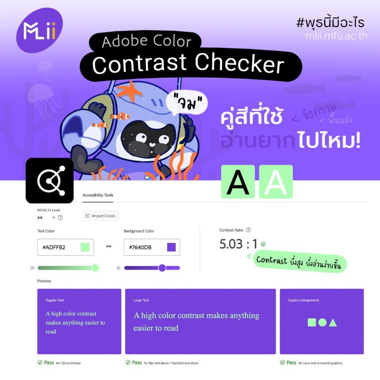
ตัวช่วย ตรวจสอบความคมชัดของสี
การจับคู่สีเป็นสิ่งสำคัญมาก โดยเฉพาะในงานออกแบบ เพราะสีมีผลต่อความรู้สึกและการรับรู้ 
แต่…แต่…แต่…คู่สีที่เราใช้ จะอ่านยากไปหรือเปล่า 
วันนี้เราขอแนะนำ “ตัวช่วย” ตรวจสอบความคมชัดของสี
“Contrast Checker จาก Adobe Color”
เข้าไปที่เว็บไซต์ color.adobe.com
คลิก CREATE
ตามด้วย Accessibility Tools
Adobe Color จะแสดงตัวอย่างสีข้อความและกราฟิก บนสีพื้นที่เราเลือก
ยิ่งค่า Contrast Ratio สูง = ยิ่งดูง่าย อ่านง่าย
ใส่รูปผลงานที่เราออกแบบ เพื่อให้เว็บช่วยตรวจสอบให้ได้ด้วย
“Make sure your color choices are as accessible as possible by checking the contrast ratio of your background and text colors.”